
Visualizing Data, with Processing and JRuby
Here’s a data visualization experiment including a mini data warehouse, to
visualize the amount of vegetarians around the word.
I planned the following:
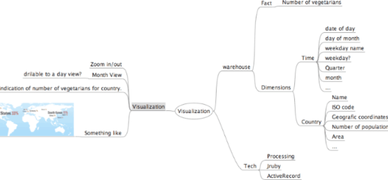
It goes like this, imagine looking at world map, with each country showing the number of vegetarians, you should be able to zoom in to europe for example, to see which country leads vegetarian eating or zoom out and see the whole world picture, click on a specific country and see the statistics for that country for a full month, or choose a particular day of month to visualize the whole world on that day. Also is desired map like navigation, were is possible to drag the map around, zoom in and out.
On the technical side, as i was interested in using Processing framework and because I am a ruby addict, this turned out to be a good excuse to play with jruby.
Part 1 - Aggregating Data
Normally this process involves a lot of work, but i had a shortcut, i was able to collect clean data from another database. I’m interested in the table with vegetarian people. But what to collect? what to summarize/aggregate? what to calculate ?
NOTE: Specify up front what is the goal of the visualization as much as possible, this will influence the way all design will be done. I had to repeat initial steps a couple of times as the visualization ideas developed, like re- agregating all the data and calculate new fields.
So in an warehouse fashion lets choose the measures and dimensions:
measures:
- number of vegetarians.
Dimensions:
- Time.
- Localization(country).
measures: are generally numeric data that captures specific values.
dimensions: contain the reference information that gives each transaction its context. When dimensions are created they should be as enriched with most information as possible (and calculated values).
Next Step is to build the warehouse, for this is used a plain database where i created 3 tables:
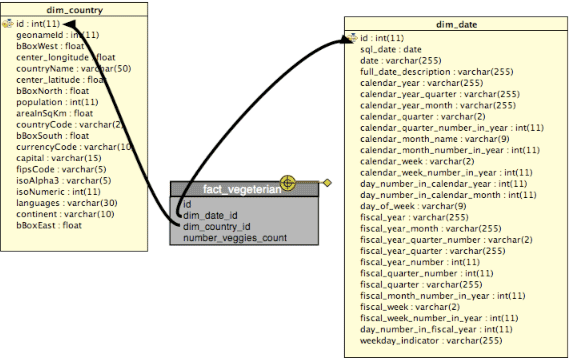
Dimension Country:
Initially i only had 2 char ISO code identifying country, but i enriched the dimension with all the other values.
I used geoname.org webservice to collect other values. Specially important are the geo coordinates for the country bounding box which where used to calculate central latitude and a central longitude of a country, that is going to be used for the visualization.
Things like continent, population, capital, are can be used later for summarizing data for continent, for showing ratio of number of vegetarians for total of population, number of vegetarians for square meter, etc, etc… think of the possibilities… :)
Dimension Time:
Made the finest granularity detail as a day. Then from a day, we can calculate, day, month, year, day of week, weekday?, day in year, day in month, quarter, week day name, etc etc…
What is this useful for? Well imagine you want to see number of vegetarians on wendenesday’s compared to monday’s, or the same for quarters, or months, maybe getting close to summer months, the number of veggies might go up a bit ?
Aggregating
With the basic schema laid-out, its time for data collection. I used the ActiveRecord part of the rails framework, using jruby. Its not the first time i’ve used ActiveRecord as standalone and i like it a lot… simplifies data access hugely, and because its all inside ruby, i get the added bonus of doing some calculations that would be much harder in pure sql. These collected and calculated values are then inserted into a local mySql using the schema above: factvegetarian, dimdate and dimcountry.
I’ve collected values for a whole month.
Resulted in 225 lines of code for the warehouse part code, with some comments… but no repeated code.
Part 2 - Building a Visualizer
The visualizer is a cycle that refreshes the interface, on each cycle the database is queried, with a set of filters, like view, date, country. The filters are updated when user clicks on the interface. Like clicking on US, will set the the filter country to US, on the next refresh data for US is obtained and the interface updated accordingly.
Application was divided into different drawing components:
- Show World Data, its the opening scenario, showing the whole world for a 1 month’s period.
- Show Country, used showing a specific country stats.
- Show Stats, a strip at bottom showing a graph of the number of vegetarians per day, over a month’s perdiod.
- Show Buttons, button used to control zoom, reset, etc…
(Probably a refactoring will reduce the Show World Map and the Show Country into a single Drawing component, has a lot of repeated code.)
I’ve created a different module for each one, which were then mixed into main class the inherits from Processing.Sketch.
Made some stuff clickable:
-
country codes, displayed on top of the countries, so the user has the possibility to filter and see stats on bottom of a single country. This is done by identifying which country coordinates is closer to the mouse coordinates.
-
Also on the bottom, the stats strip has on the x axis the possibility to click on the day of the month, so the user can select a particular day and that will update the world visualization, showing the numbers of the number of vegetarians for a given day for all the world.
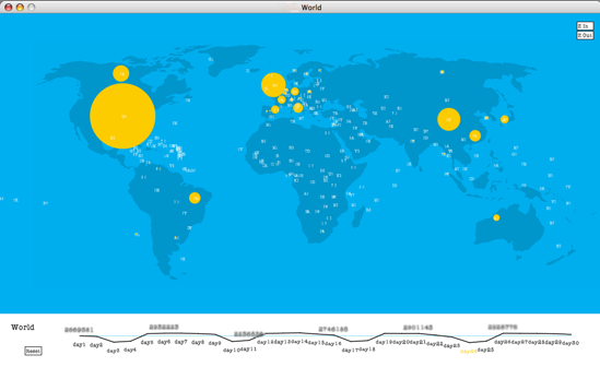
And here’s what it looks like:
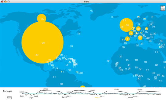
When Zoomed in, and showing Portugal stats on the bottom:
Ended up with 584 lines of code, with a big chunk of repeated code, on the visualization part.
Overall making the visualization was a lot more work that the warehouse part, because I had a lot of fighting around with correct coordinates positioning, getting a decent map, maintaining map country coordinates with the zooms.
Using jruby was mostly a nice experience, there are a couple of things to learn at first, for example on how to include java libraries, no biggie, but I had also a type conversion issue when i tried to refactor the code at some point, i guess its because of the java type’s, that jruby guys hide and convert automatically … but most likelly its because of my inexperience with jruby…
I’ve used version 1.0 of jruby, i think is a great work that jruby guys have done, making accessible to ruby community all the millions of java libraries out there. But of course don’t expect to do 100% ruby code like you do with old ruby, sometimes there’s some java lurking out of the jruby box.
the Good
Well, its very cool to be able to use ruby for Drawing. Gives power that regular ruby does not have. Exists huge amount of libraries, to use with it. Connection to Java is indeed very powerful.
the Bad
Visualizations are hard, ended up with a lot of repeated code repeated and all over the place. Why? Well partly because im a newbie in jRuby, but partly because Processing seems to fit better for small Sketch visualizations.
Ideas
Is it possible to do a little architecture around it?, to make it a bit better, isolating all drawing stuff.
Processing
Processing is great, has also huge potential, had a couple of troubles with 1 or 2 plugins i tried, but i end up using base distribution and that works and feels 100%. I look forward to do more stuff with it, it is fun!