
Monitoring Productivity Experiment

For over a year now, i’ve been collecting how much time i spend in computer and how much of it is actually used in creative/productive activities.
By productive activity i mean that the time spent in text editor(emacs), terminal, excel or a database client is likely to be more creative/productive than the time spent in youtube, twitter, reading rss feeds, IM Chatting or replying Email. In average.
This is overly simplified, but the tools i’m using work specially well for this, including automatic data collection without the need for manual data entry.
Tracking Time
I’m using the RescueTime application that tracks when there’s user activity on a particular computer application. And then i copy the data onto a google doc spreadsheet, keeping only a summary per week. RescueTime like any other app, can have its hiccups, and i’ve noticed a couple of rare occasions when it was not tracking well, but overall works well.
Data
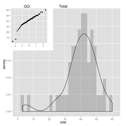
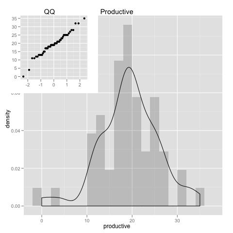
Per week i collect the hours of total, productive and distracting time.
Besides productive and distracting, there’s also the neutral time, that is something in between, for example, things like moving files around(in finder the osx equivalent of windows explorer), a google search or even a data gap that i am not able to classify they all go into the neutral time bucket.
thus, total = productive + distracting + neutral
I’ll look here at a full year(52 weeks worth of data).
google.spreadsheet <- function (key) {
  library(RCurl)
  # ssl validation off
  ssl.verifypeer <- FALSE

  tt <- getForm("https://spreadsheets.google.com/spreadsheet/pub",
                hl ="en_GB",
                key = key,
                single = "true", gid ="0",
                output = "csv",
                .opts = list(followlocation = TRUE, verbose = TRUE))

  read.csv(textConnection(tt), header = TRUE)
}

# load the data
mydata = google.spreadsheet("0AnypY27pPCJydGNCcDhIVVRyZ1ZMWnBTbjBQbmJ0WVE")

# Create a new column with the proper date format
mydata$date = as.Date(mydata$date, format='%d/%m/%Y')

# include ggplot2
library(ggplot2)
How is data distributed
pl <- ggplot(data = mydata)
#subplot viewport
subvp <- viewport(width=0.4, height=0.4, x=0.22, y=0.80)

his = pl +
      geom_histogram(aes(x=total,y=..density..),alpha=0.2,binwidth=2) +
      geom_density(aes(x=total)) +
      opts(title = "Total")
qqp = pl +
      geom_point(aes(sample=total), stat="qq") + labs(x=NULL, y=NULL) +
      opts(title = "QQ")
print(his)
print(qqp, vp = subvp)
his = pl +
      geom_histogram(aes(x=productive,y=..density..),alpha=0.2,binwidth=2) +
      geom_density(aes(x=productive)) + opts(title="Productive")
qqp = pl +
      geom_point(aes(sample=productive), stat="qq") + labs(x=NULL, y=NULL) +
      opts(title = "QQ")

print(his)
print(qqp, vp = subvp)
his = pl +
      geom_histogram(aes(x=distracting,y=..density..),alpha=0.2,binwidth=2) +
      geom_density(aes(x=distracting)) + opts(title = "Distracting")
qqp = pl +
      geom_point(aes(sample=distracting), stat="qq") + labs(x=NULL, y=NULL) +
      opts(title = "QQ")

print(his)
print(qqp, vp = subvp)
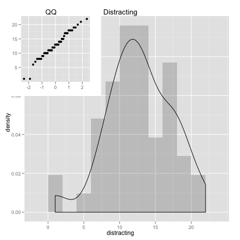
For the exception of a couple loose ends, we see that the data follows the normal distribution quite well. Which allows for a few assumptions when analyzing it. And we could even cut off those loose ends(by excluding data), for even a more perfect match to the normal distribution.
How many hours spent in computer?
(sum(mydata$total) / 24) / 365
Almost 1/4(~25%) of the whole year in front of computer. Wow!
How many hours per day?
ttest <- t.test(mydata$total, conf.level = 0.95)
print(ttest)

          1
[1] 0.2391553

        One Sample t-test

data:  mydata$total
t = 27.3738, df = 51, p-value < 2.2e-16
alternative hypothesis: true mean is not equal to 0
95 percent confidence interval:
 37.33372 43.24320
sample estimates:
mean of x
 40.28846
Values are between [37.33372, 43.24320] for 95% confidence. Which means that ~40 is a very good estimation of the average time.
So thats close to 40 hours per week, almost 6 hours per day in computer. And this is in average for the whole year, that is, it includes weekends, vacations, holidays, etc…
Note: during the (8h)work day we are not 100% of the time active in computer, from my own data, RescueTime says that for a full hour in front of computer without interruptions, it captures in average 45min of activity. So, from a 8h working day you get already only 6h of active computer time, if you then add in the meetings, breaks, ocasional discussions, etc… that value goes lower.
Searching for Correlations
plotmatrix(mydata[2:4]) + geom_smooth(method="lm")
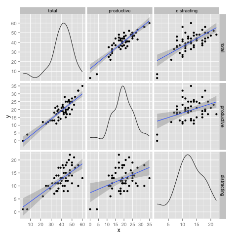
cor(mydata[2:4])
                total productive distracting
total       1.0000000  0.8719531   0.6884407
productive  0.8719531  1.0000000   0.4027419
distracting 0.6884407  0.4027419   1.0000000
Total and Productive time seem to be strongly correlated, what it means? there’s 2 ways to look at it:
- increasing productive time the total goes up.
- increasing total time the productive goes up.
So, 1. is obvious and not interesting, but could 2. be true?
Well, if we compare productive vs distracting, we see that productive(0.872) has a stronger correlation to total time than distracting(0.688). And because increasing distracting time will always increase the total(in exactly the same way as productivity will, as 1.) then it means that increasing the total is more likely to increase productivity time then the distracting time.
Trends
ggplot(mydata, aes(x=date)) +  labs(x=NULL, y=NULL) +
  opts(legend.position="bottom") +
  geom_line(aes(y = total, colour="total")) +
  geom_smooth(aes(y = total, colour = "total")) +
  geom_line(aes(y = productive, colour="productive")) +
  geom_smooth(aes(y = productive, colour = "productive")) +
  geom_line(aes(y = distracting, colour="distracting")) +
  geom_smooth(aes(y = distracting, colour = "distracting"))
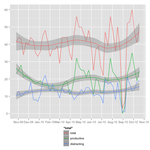
The big drop towards the end is a 2 week vacation, where i barely used computer.
In the first half of the plot there is a drop in productivity, accompanied by an increase on distracting time.
It also shows that close to the end(last couple of months) there’s a tendency for increase in all categories.
The Gear
This post was also made to try out the OrgMode Babel mode that i’ve discovered recently, that allows for literate programming(mixing in same document live/executable code and text).
This doc was written in (Aqua)Emacs using Orgmode. R as the statistics toolbox, loaded with the nice ggplot2 graphics package. This allows for a very smooth work flow for creating this type of documents and it works very well :)